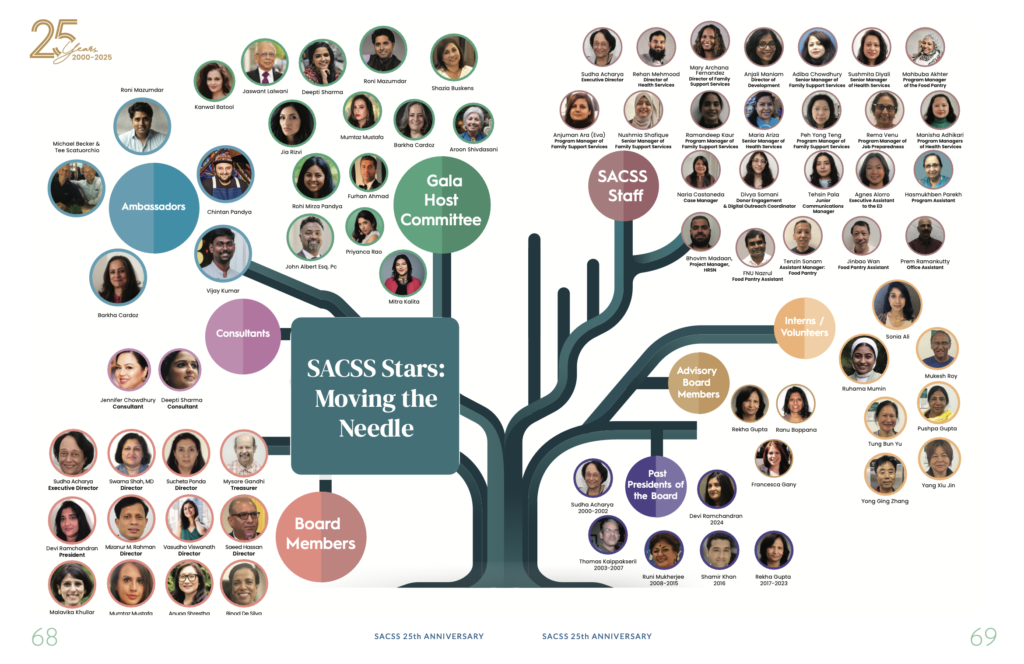
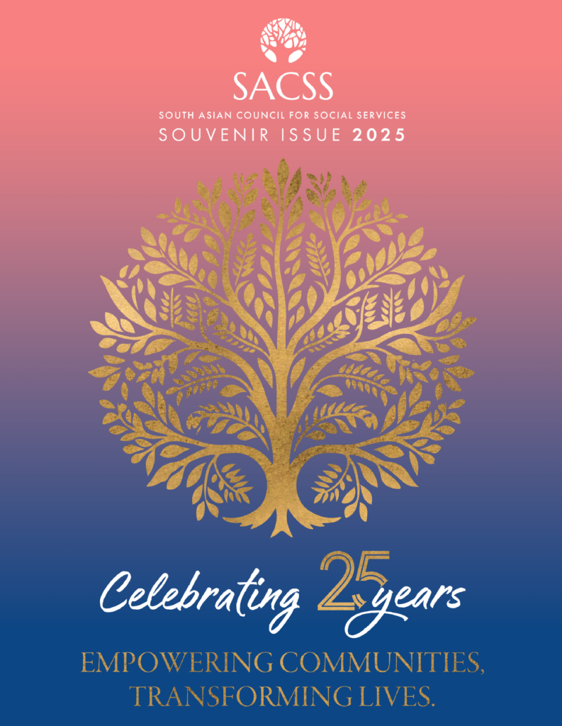
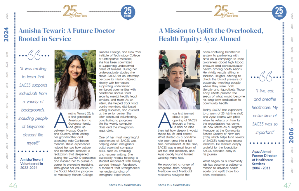
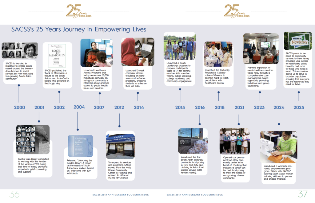
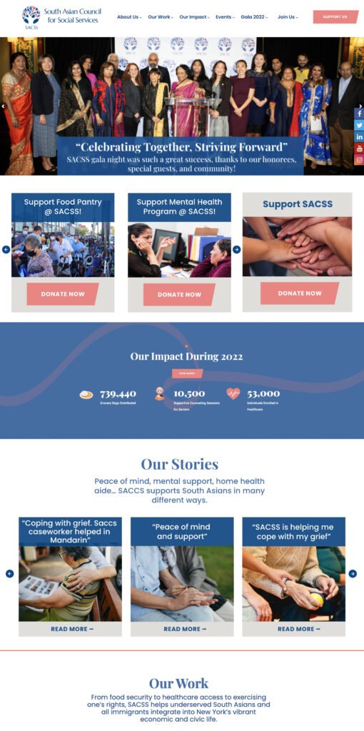
SACSS (South Asian Council for Social Services) is a New York–based nonprofit dedicated to empowering immigrant communities through healthcare, education, advocacy, and social services. I developed a complete brand identity system centered around the universal symbolism of a tree, creating a visual language that communicates growth, resilience, trust, and belonging.

SACSS
2020-2021
SACSS (South Asian Council for Social Services) is a New York–based nonprofit dedicated to empowering immigrant communities through healthcare, education, advocacy, and social services. I developed a complete brand identity system centered around the universal symbolism of a tree, creating a visual language that communicates growth, resilience, trust, and belonging.

SACSS needed an identity that could represent its diverse community while communicating compassion, trust, and long-term impact. The challenge was to create a timeless symbol that transcended language and culture, resonating with immigrants from different backgrounds while reinforcing the organization’s mission of empowering individuals and strengthening communities.
The identity was built around the metaphor of a tree—a universal symbol of life, growth, and support. Every element was given intentional meaning:
The visual system was designed to scale seamlessly across print, publications, fundraising campaigns, digital platforms, signage, and community outreach while maintaining a consistent and recognizable identity.
The new identity provided SACSS with a distinctive and meaningful visual language that strengthened recognition across its programs and communications. More than a logo, it became a symbol of resilience, opportunity, and belonging—helping the organization communicate its mission with clarity and consistency while building stronger connections with the communities it serves.